hello! i'm kensi, a high school senior with an interest in information science and design engineering. thanks for checking out my portfolio!
FEATURED WORK ↓

Monologue Show Poster, 2026


Midnight Beverage, 2024 (Scholastic Honorable Mention)


Medieval Vector Art Piece • 2026


Next Gen Tech Website, 2025


Baseball Gameday Instagram Post, 2026


Shirley Fizz Product Design, 2025 (SCHOLASTIC HONORABLE MENTION)


Hope For Hospitals Website, 2026


NVHS Wellness Week Post Card • 2026

thanks for visiting my digital portfolio!
while you're here, let's connect →
Kensington Chong → Updated August 2026
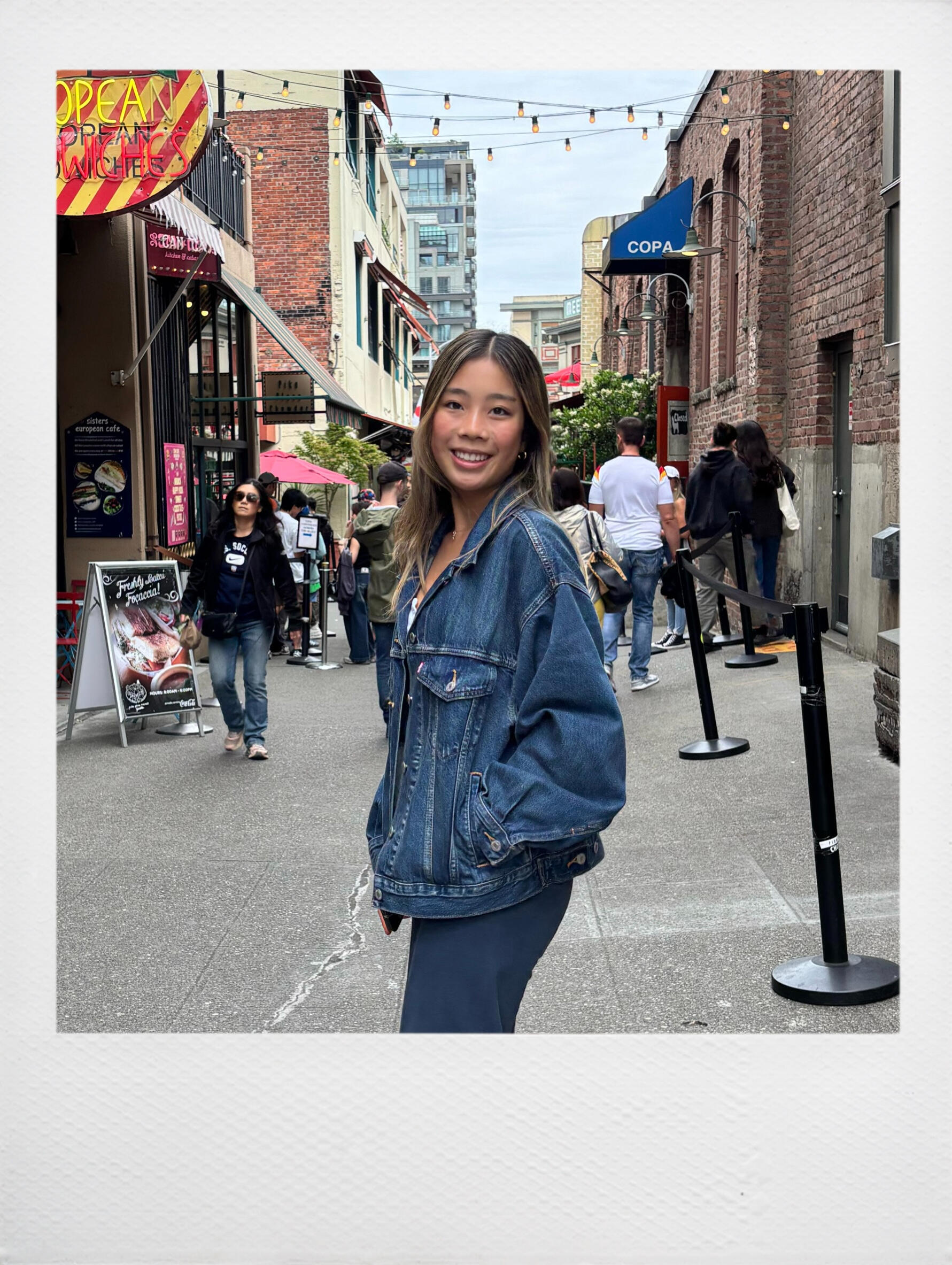
nice to meet you, my name is Kensi! 𓂃˖ ࣪ ‧₊˚♡
SCROLL FOR MORE ↓
ABOUT
Hello! I'm Kensi, a high school senior with an interest in Information Science and Design Engineering, and hope to bridge the gap between artistry and AI while promoting human usability.As a designer, I focus on minimalism and impact that keep the viewer’s attention. Unexpected subjects, bold lettering, and bright duotone designs are all strategies I employ. I also look towards mixing art styles and taking inspiration from traditional techniques in a digital realm, making my designs more natural and organic.When I'm not at my computer, you can find me playing basketball and volleyball. Being a student-athlete is a big part of my identity, and it has taught me how to prioritize my time and learn to find balance. Another thing I enjoy doing is playing the guitar. I am entirely self taught, and I try to find time to practice whenever I can.I'm always eager to learn, collaborate, and grow with my peers, so don't hesitate to reach out!
CURRENT FAVS
thing: working out
song: (one of those) crazy girls - paramore
food: smashed potatoes
drink: wild cherry chill'r bubbl'r
RECENTLY...
I have been working on my college applications!
thanks for visiting my digital portfolio!
while you're here, let's connect →
Kensington Chong → Updated August 2026
projects
A showcase of personal or academic projects that feature
descriptions about my design process
Shirley Fizz
PRODUCT DESIGN
& GRAPHIC DESIGN
DECEMBER 2025 → JANUARY 2026
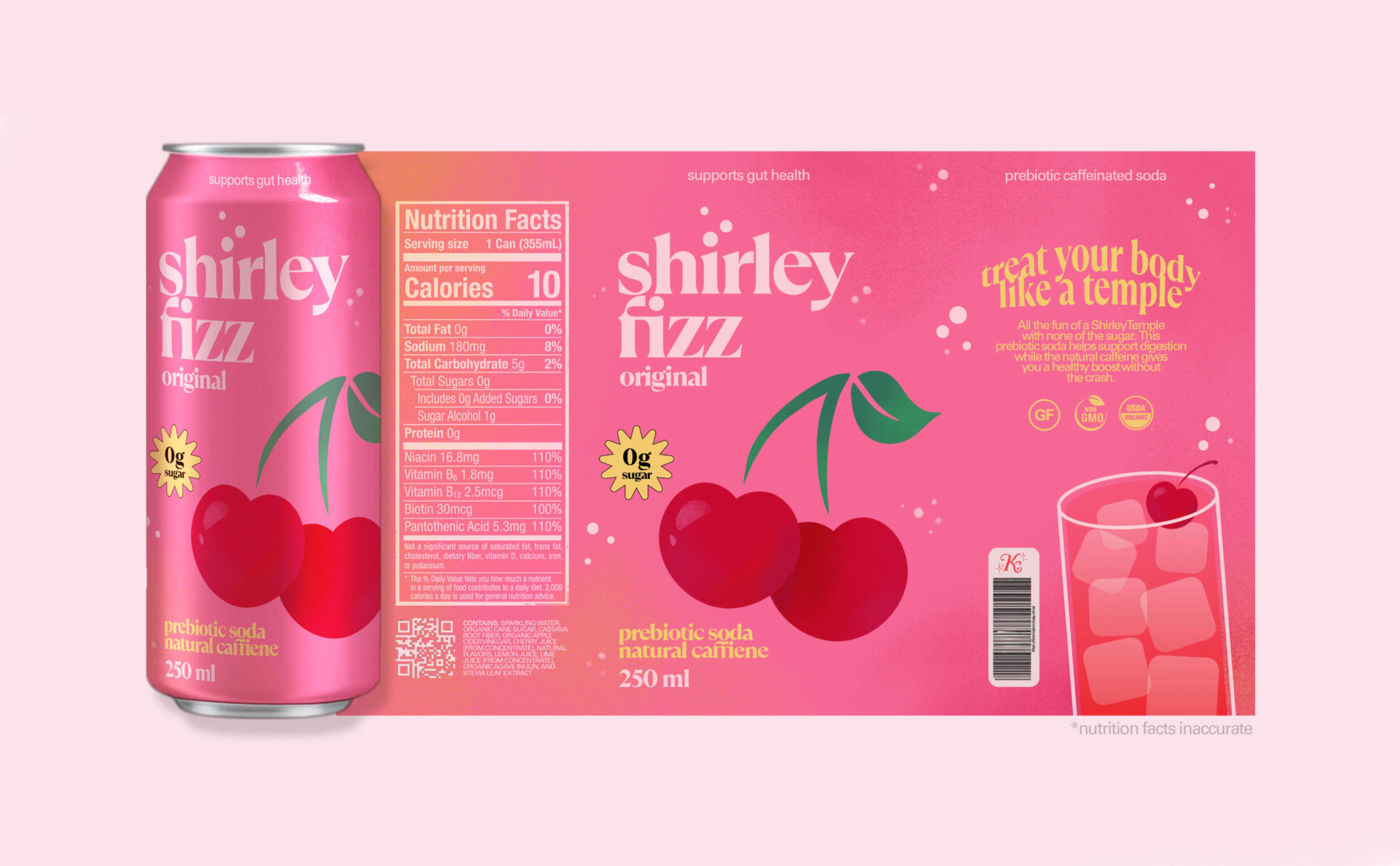
A product & graphic design project I created to submit to Scholastic Art and Writing Awards. Features a can wrap design, design system, and possible advertisement.This piece was awarded an honorable mention in the graphic design category.
NVHS Monologue Show
GRAPHIC DESIGN
JANUARY 2026
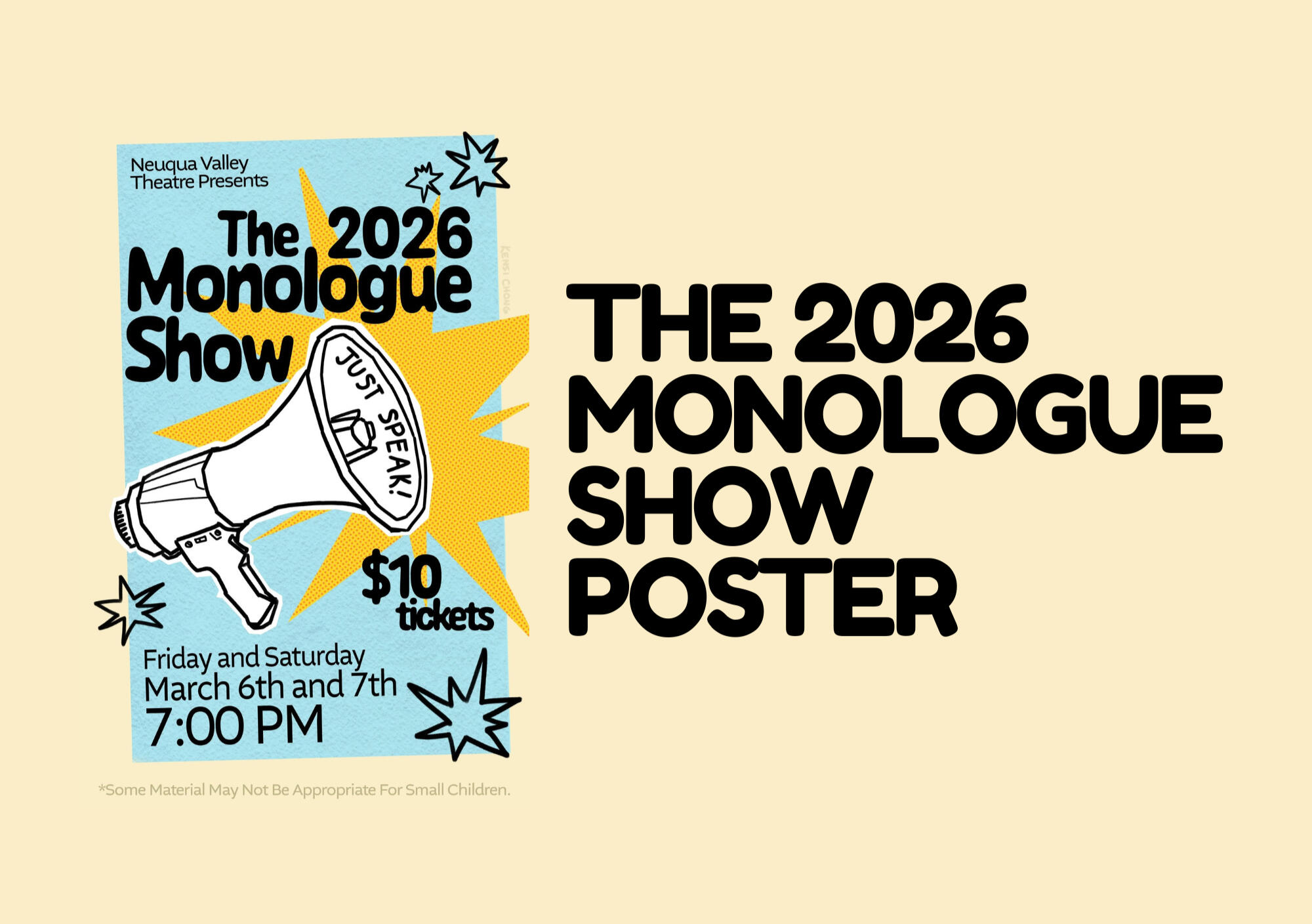
The NVHS Monologue Show is a theatrical production that features original student performances. I was chosen by my computer graphics teacher, Mr. Johnson, to create this piece that would later be turned into posters and t-shirts.
Hope For Hospitals
WEB DESIGN
FEBRUARY 2026 → JULY 2026
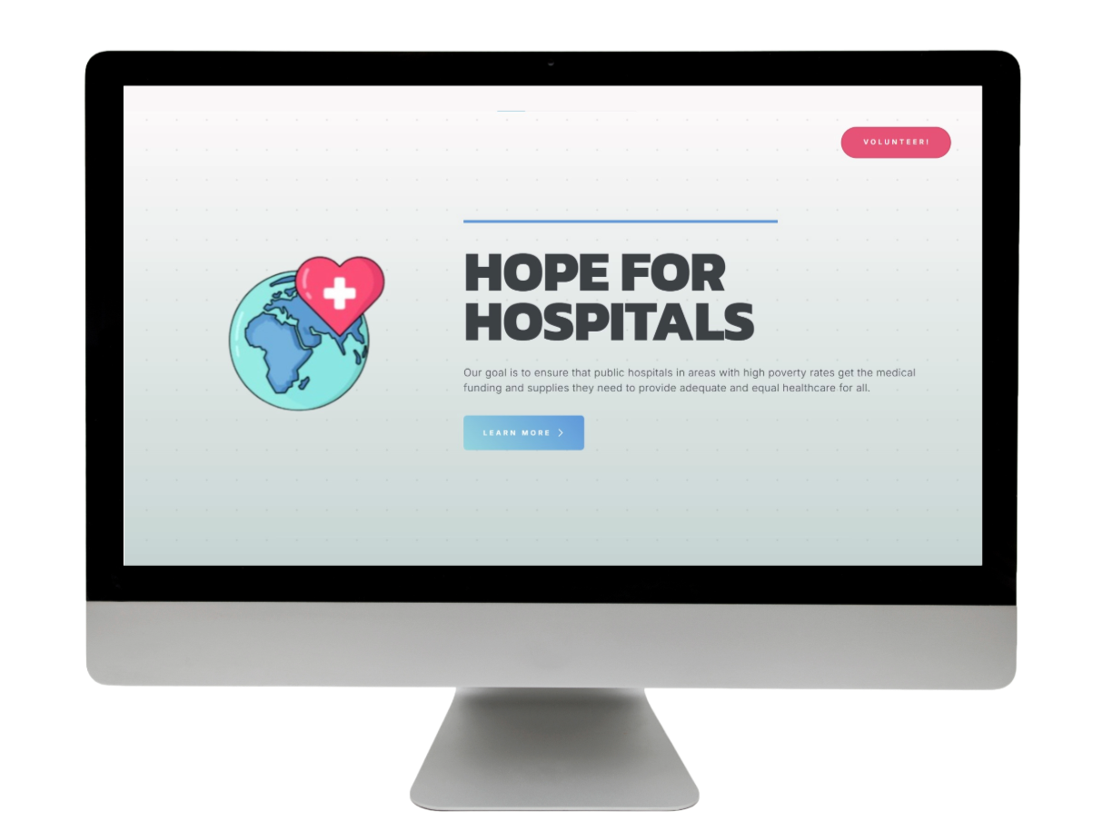
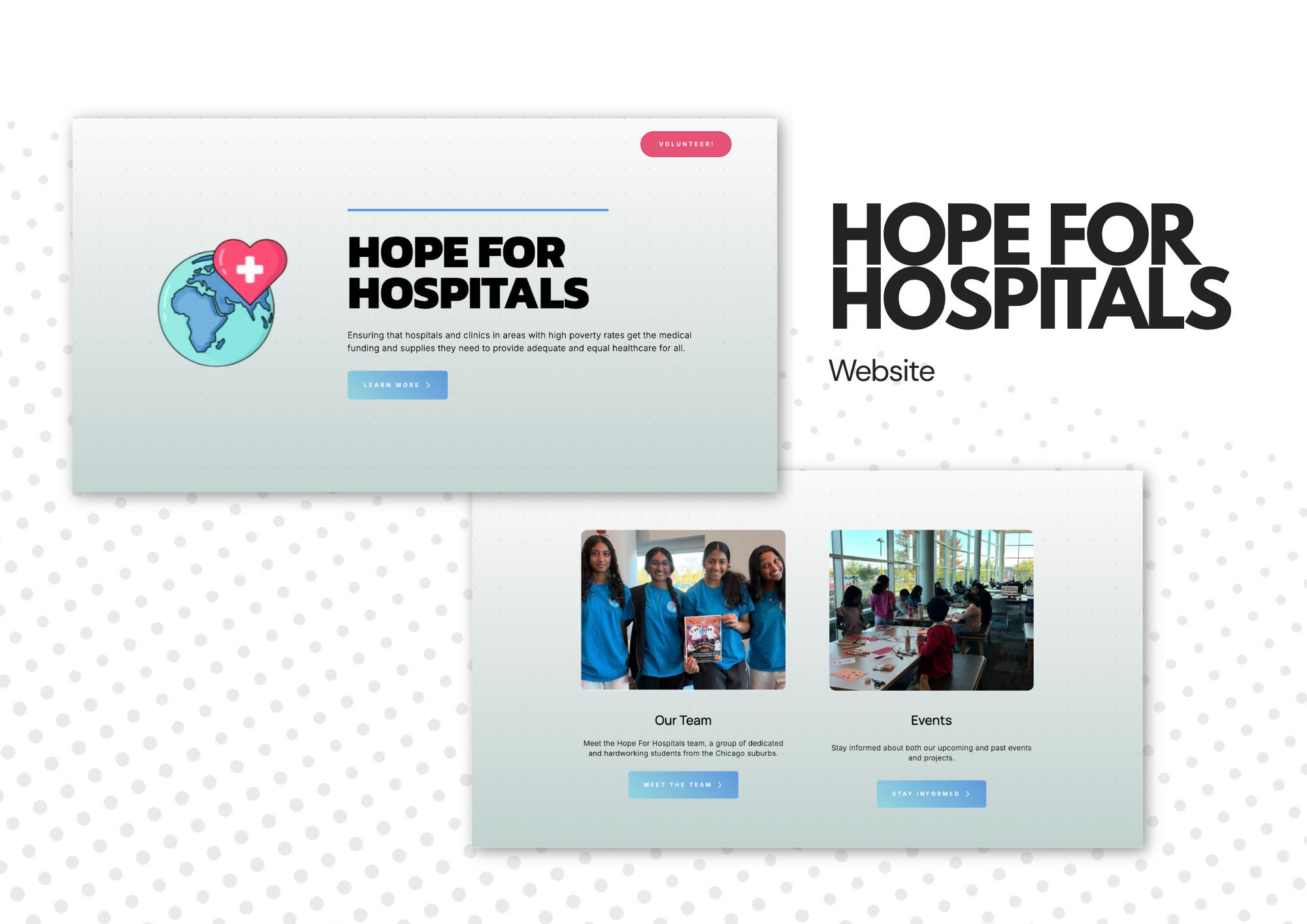
In this project, I created a website for Hope For Hospitals: a youth-led nonprofit that ensures that public hospitals in areas with high poverty rates get medical funding and supplies.The website contains information about their mission, their board members, and events they are hosting or have hosted.Visit the site at hopeforhospitals.org
Batter For Better
BRAND IDENTITY
& GRAPHIC DESIGN
MAY 2026 → JUNE 2026
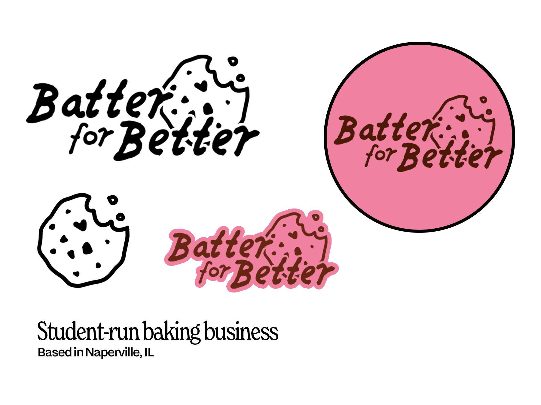
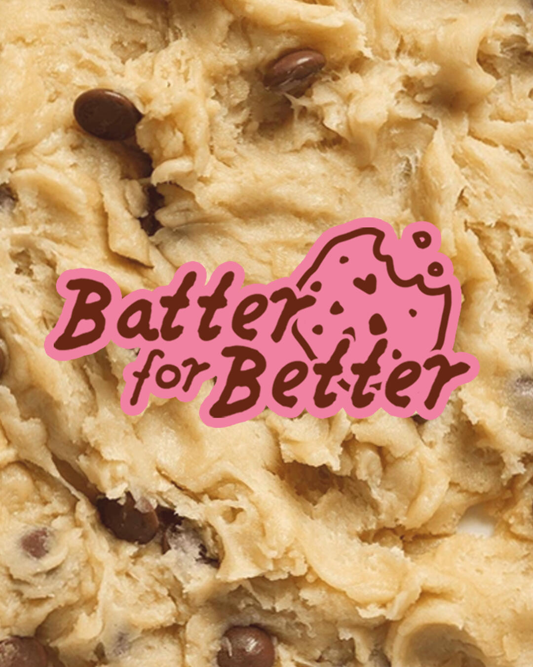
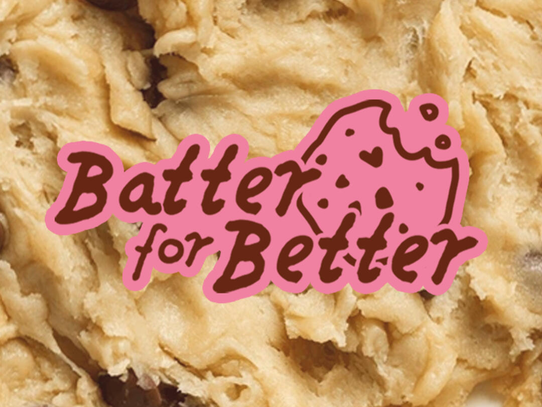
In this project, I rebranded a small, student-run cookie business that donates its profits to charities.My work included a new logo as well as possible post designs for their social media page.Visit their Instagram at @Batter_for_Better
Personal Brand & Website
BRAND IDENTITY
& WEB DESIGN
MARCH 2025 → PRESENT
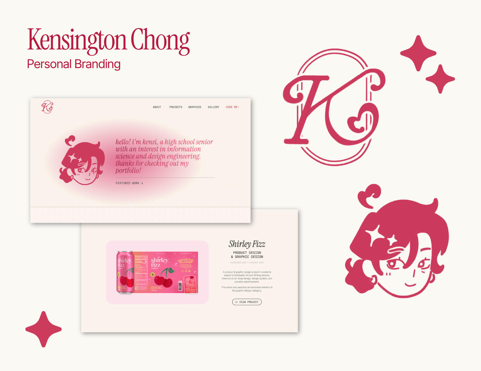
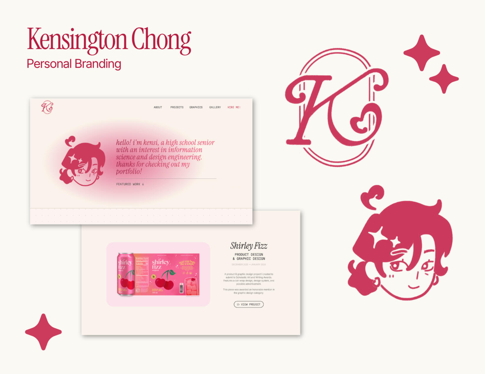
In this project, I created a personal design system that I could use for my digital portfolio (website), resume, and other projects.
NVHS Choose Your Fight
GRAPHIC DESIGN
AUGUST 2026
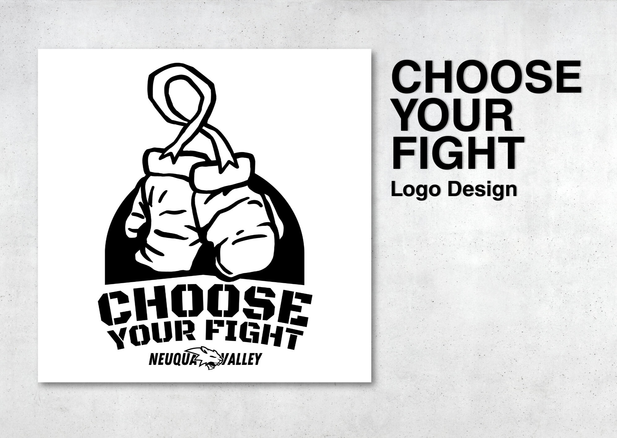
"Choose Your Fight" is a new school spirit event created by Gold Rush. As one of the social media managers for this club (which chooses sporting event themes and advertises student activities), I had the opportunity to create a logo for it.The concept of "Choose Your Fight" is having the ability to pick a cancer organization that is personal to you.
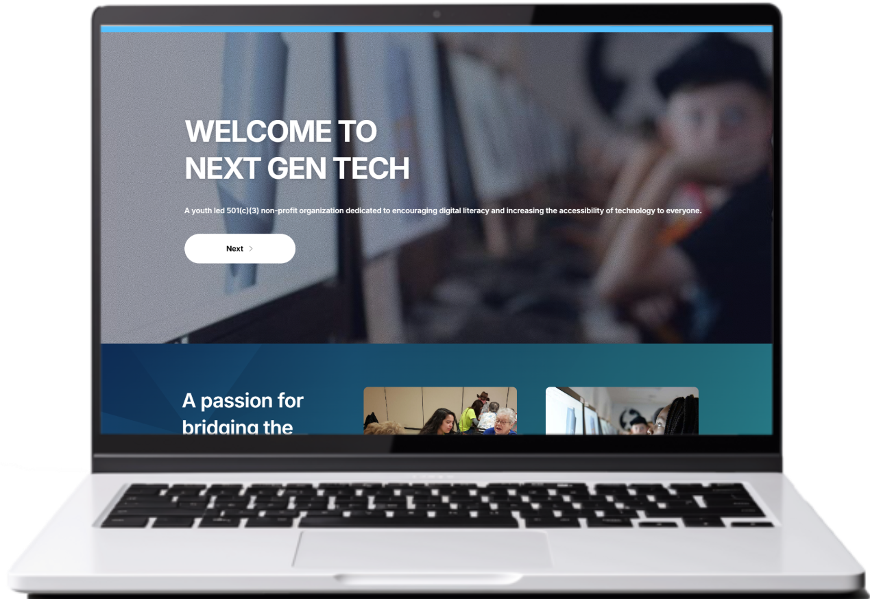
Next Gen Tech
WEB DESIGN
DECEMBER 2024 → FEBRUARY 2025
In this project, I created a website for Next Gen Tech: a youth-led nonprofit that aims to teach digital literacy to younger and older generations.The website contains information about their mission, their board members, and events they are hosting or have hosted.Visit the site at nextgentechnpf.com
thanks for visiting my digital portfolio!
while you're here, let's connect →
Kensington Chong → Updated August 2026
graphics
A collection of personal and academic projects focusing
on computer graphics and other visual designs
Baseball Gameday Post
GRAPHIC DESIGN • 2026
Instagram Reel Cover
GRAPHIC DESIGN • 2026
Western Gameday Post
GRAPHIC DESIGN • 2026


Construction Gameday Post
GRAPHIC DESIGN • 2026
IPV Volleyball Logo Redesign
GRAPHIC DESIGN • 2026
Crone Middle School, Class of 2023 Merch Design
GRAPHIC DESIGN • 2023


thanks for visiting my digital portfolio!
while you're here, let's connect →
Kensington Chong → Updated August 2026
‧₊˚ gallery ‧₊˚
A collection of random pieces I have created including digital illustrations, unfinished works, and sketches!
NVHS Wellness Week Post Card • 2026

Medieval Vector Art Piece • 2026


NVHS Wellness Week Coloring Page • 2026

"Midnight Beverage", Scholastic Honorable Mention • 2024


Apple of My Eye • 2025


Original Character Lineup • 2026


"You are Two" • 2025

The Great Gatsby ELA Project • 2025


The Great Gatsby Word Art • 2026

thanks for visiting my digital portfolio!
while you're here, let's connect →
Kensington Chong → Updated August 2026
hire me!
SERVICES
Digital illustration & painting commissions (character design, backgrounds, etc.)
Carrd website creation
Simple video editing and tweening
Social media graphics & posts
Logo design
Brand identity & marketing assistance or advice
Product design creation, assistance or advice
SKILLS
Adobe Photoshop, Illustrator, Express
& FireflyCanva
Capcut
CONTACTS
thanks for visiting my digital portfolio!
while you're here, let's connect →
Kensington Chong → Updated August 2026
PROJECT OVERVIEW
Shirley Fizz
PRODUCT & GRAPHIC DESIGN • 2026 SCHOLASTIC HONORABLE MENTION
OVERVIEW
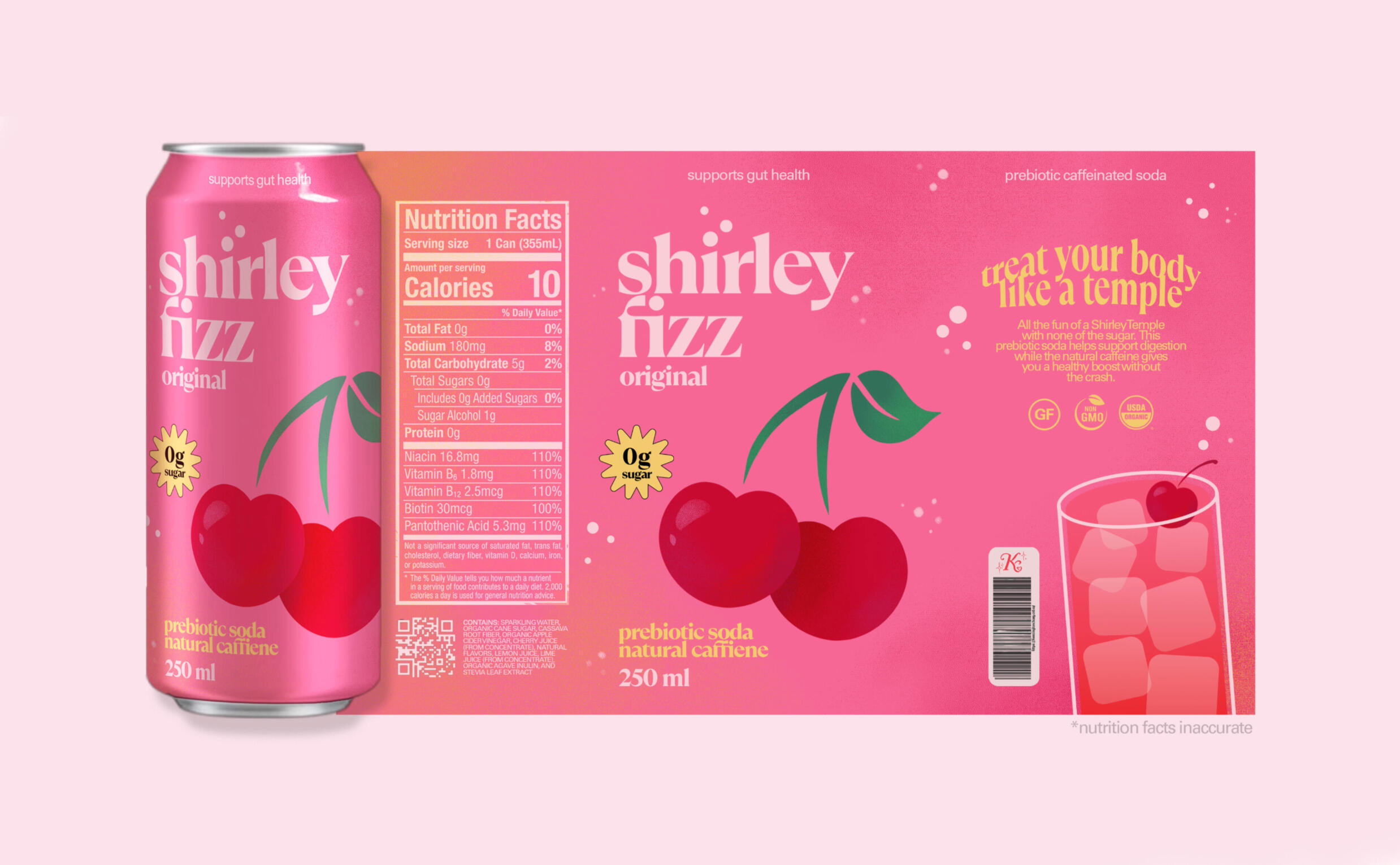
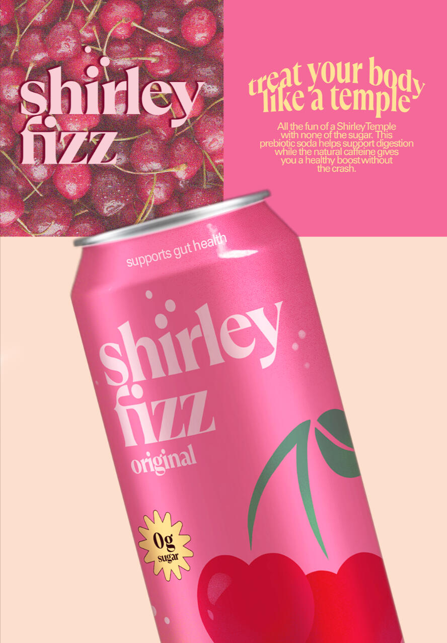
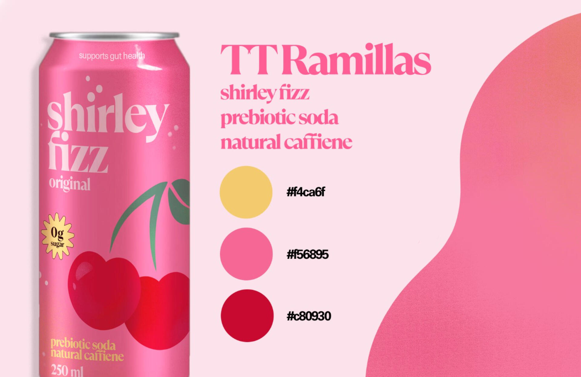
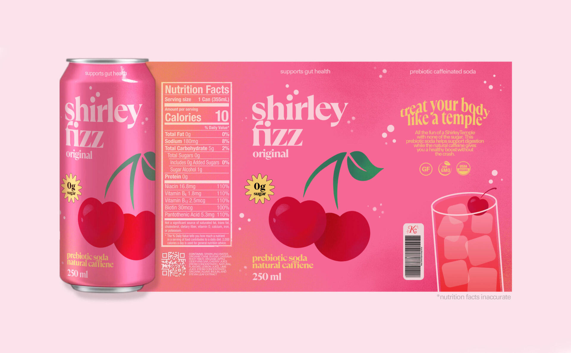
This design was created to be submitted to the Graphic Design category for the 2025 Scholastic Art and Writing Awards. The goal was to create something unique that still had an appeal to me as a consumer of energy drinks. My submission features a can design for a prebiotic caffeinated soda, along with its own custom slogan: "Treat your body like a temple." It also included a possible advertisement for the drink as well as a page that recorded the typography and color palette of my final draft.
IDEATION
During my brainstorming process, I took inspiration from successful brands with a similar target audience (which would be high school or college students, likely female) such as Bloom, Poppi, and Bubbl’r. At the time of this project's creation, Shirley Temple flavors had not become popular outside of the typical drink.
PROCESS
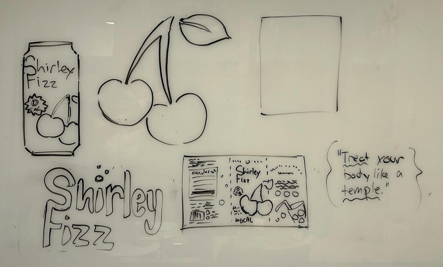
The entire work was created on Adobe Photoshop. I worked on the final product(s) across one whole week with the bulk of my work spanning across 3 days. I typically start by taking the physical sketches I create (in this case, it was on a white board) and uploading a scan of them onto my computer to trace over or build upon. Next, I began to work on a design system—although "Shirley Fizz" is not an existing brand, establishing a simple design system at the beginning of a project helps guide the entire design process. After testing many different fonts and palettes, I landed on a combination I liked and completed a can wrap design as well as a possible advertisement. In total, my submission to Scholastic had 3 finished products.
SUBMISSIONS
BRAND CAMPAIGN
Treat your body like a temple.
The slogan I created is a simple play on words. The brand name, "Shirley Fizz," doesn't include "temple" in it, which is the other half of the original drink's name ("Shirley Temples.") While the comparison of "body" to "temple" is nothing new, I thought it'd be a creative way to remind the customer of the flavor's origin as well as the brands' focus on nutritional health.
↓ ADVERTISEMENT
↓ DESIGN SYSTEM
↓ CAN DESIGN
PROJECT OVERVIEW
NVHS Monologue Show
GRAPHIC DESIGN • 2026
OVERVIEW
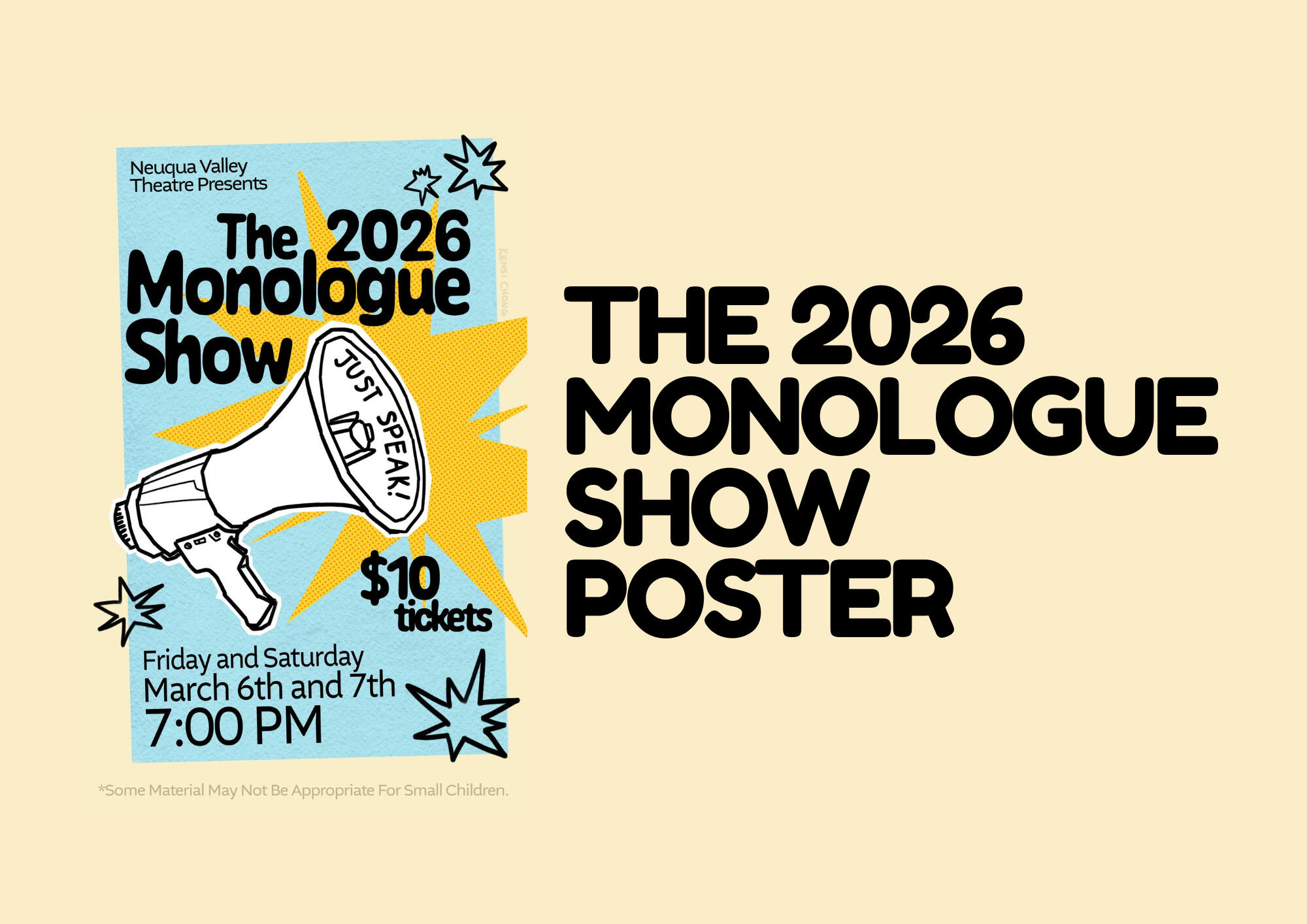
The Neuqua Valley Monologue Show is a production that puts on original student spoken performances. Every year, the theatre teacher who runs it contacts one of the computer graphics teachers to find a student who could design the poster that year. I am extremely grateful to have been selected by my teacher, Mr. Johnson, to create the 2026 Monologue Show Poster design.
The goal of this project was to create a vertical poster design that would be printed and posted online to advertise the show in just over a week. The design would also be turned into T-shirts.
IDEATION
During my brainstorming process, I took inspiration from past Monologue Show posters as well as designs I had saved in the past that I thought were eye-catching and unique. I wanted to do create something fresh that was much different from any of the recent poster designs, so I took note of how many of the compositions were visually busy due to the presence of many different subjects and detailed backgrounds.
PROCESS
COMMUNCATION
The process began with effectively communicating with my "employer," which in this case, was the theatre and English teacher Mr. Rossi. We first met in person to brief the goal and deadline of the project, where he told me he would email me the information that had to be on the poster. Other than that, I had free reign of the design as long as it was high school appropriate. From there, I had to ensure my design was completed before the deadline (which was in just over a week) and had the correct dimensions and a sufficient resolution (so it could be printed on a large scale.)
CREATION
The entire work was created on Adobe Photoshop. The entire project took me about 3 days, with one set aside for brainstorming and the other two for creation.
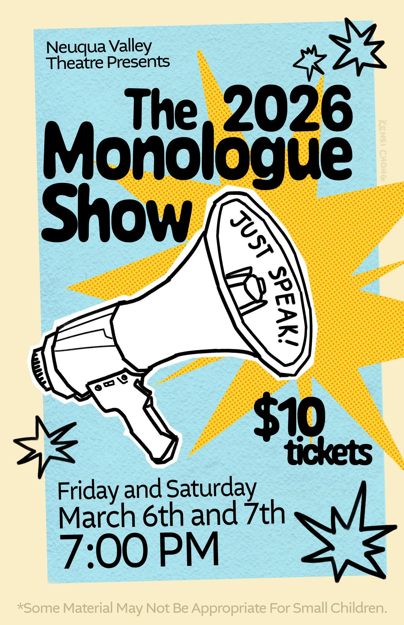
To differentiate my own design from those from the past, I went with a background that was simplistic, using varying colors and patterns to add visual interest without cluttering the composition. With the color palette, I opted for a duotone design, employing a brighter version of our school's signature colors. For the star shape in the background, I used a dot density filter to add varying patterns and give it a "comic book" feel.
For the subject, I wanted to take a unique approach. To add character to my works, I will often take inspiration from traditional art and mix it with digital design. In this piece, I hand drew the megaphone and placed the lineart layer on top of a plain white background, roughly cutting it out with the geometric lasso tool. This presents the idea that the subject was drawn then "cut out" from a physical piece of paper, creating that mixed media effect.
DELIVERABLES
PROJECT OVERVIEW
Hope For Hospitals Website
WEB DESIGN • 2026
OVERVIEW
Founded in 2025, Hope For Hospitals is a 501(c)3 youth-led nonprofit organization, originating in Naperville, IL. They host community events to ensure that hospitals and clinics in areas with high poverty rates get the medical funding and supplies they need in order to provide adequate and equal healthcare for all.The goal of this project was to build a functional website that matched the brand of the nonprofit.
PROCESS
INITIALIZATION
This project was one of self advocacy. The nonprofits founder, Anika Kusumba, is a school friend of mine, and I had heard about the founding of Hope For Hospitals through social media. I approached her, proposing the idea of creating a website for her nonprofit, using my past role as the web designer for NextGenTech to support my argument.
COMMUNCATION
The process began with Anika and the other board members sending me the information they wanted in the site via email. The creation involved a lot of back in forth to refine it into something that satisfied the entire board. At some points in the project, our communication shifted from digital to physical: I had two in person check-ins to update them on that status of the site and one final meeting to purchase and connect the website domain. During our last meeting, I had to explain the process of buying then connecting the domain to the site to Anika and her team, as well as Anika's father, who was funding the purchase.
CREATION
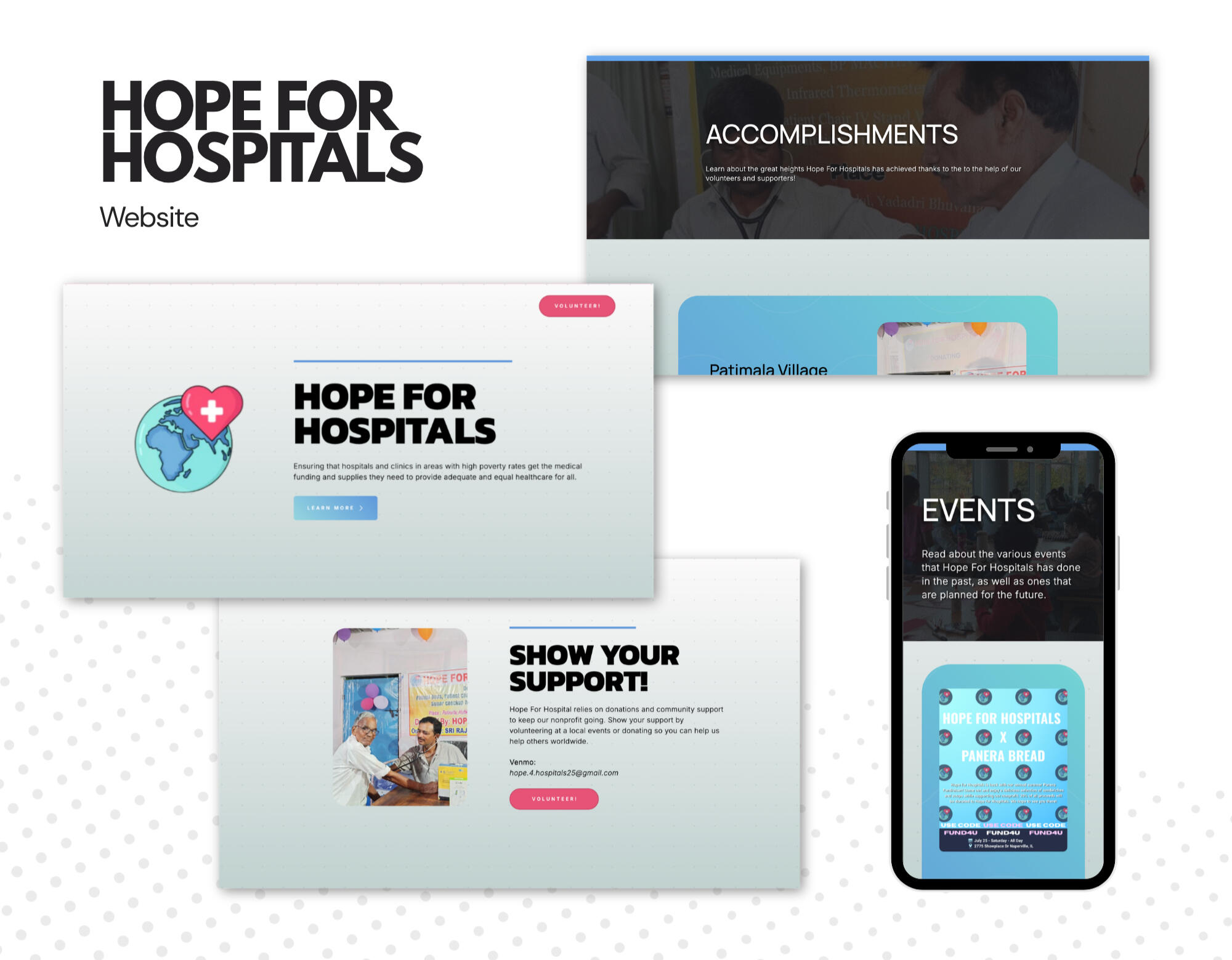
The entire work was created on Carrd. The site's development spanned over a couple of months, from February 2026 to July 2026.My focus with this site was functionality and creating a cohesive theme. Unlike my project with NextGenTech, Hope For Hospitals had an established brand with the presence of their logo. However, this was the only thing that they had created, so I developed my own color palette (based on the logo) and typography to guide the sites' creation. Taking inspiration from the logo, I utilized blue gradients for the majority of the interface, with touches of red to make certain things pop.
OUTCOME
Something signifigant about this project was ensuring that the Hope For Hospitals team could continue to update the site without going through me. Because this site was a portfolio piece and not a paid commission, I decided the best thing to do once it was complete was to step back and hand over ownership. A couple things went into this goal: first, I made sure they were the ones who own the domain. The purchase for this happened on our final in-person meeting, as mentioned above. Second, I wanted to make updating the site as easy as possible. On their events page, each event has its own "box" that displays images, paired with text that describes the event itself. These boxes are containers, a feature of Carrd, which makes it extremely easy to simply copy and paste the container and fill out the information with something new. The same thing is also present on their accomplishments page.
DELIVERABLES
PROJECT OVERVIEW
Batter For Better
BRAND IDENTITY & GRAPHIC DESIGN • 2026
OVERVIEW
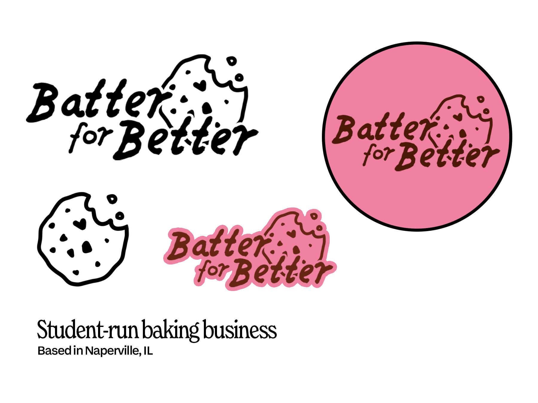
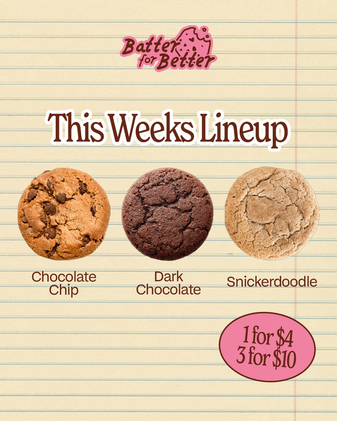
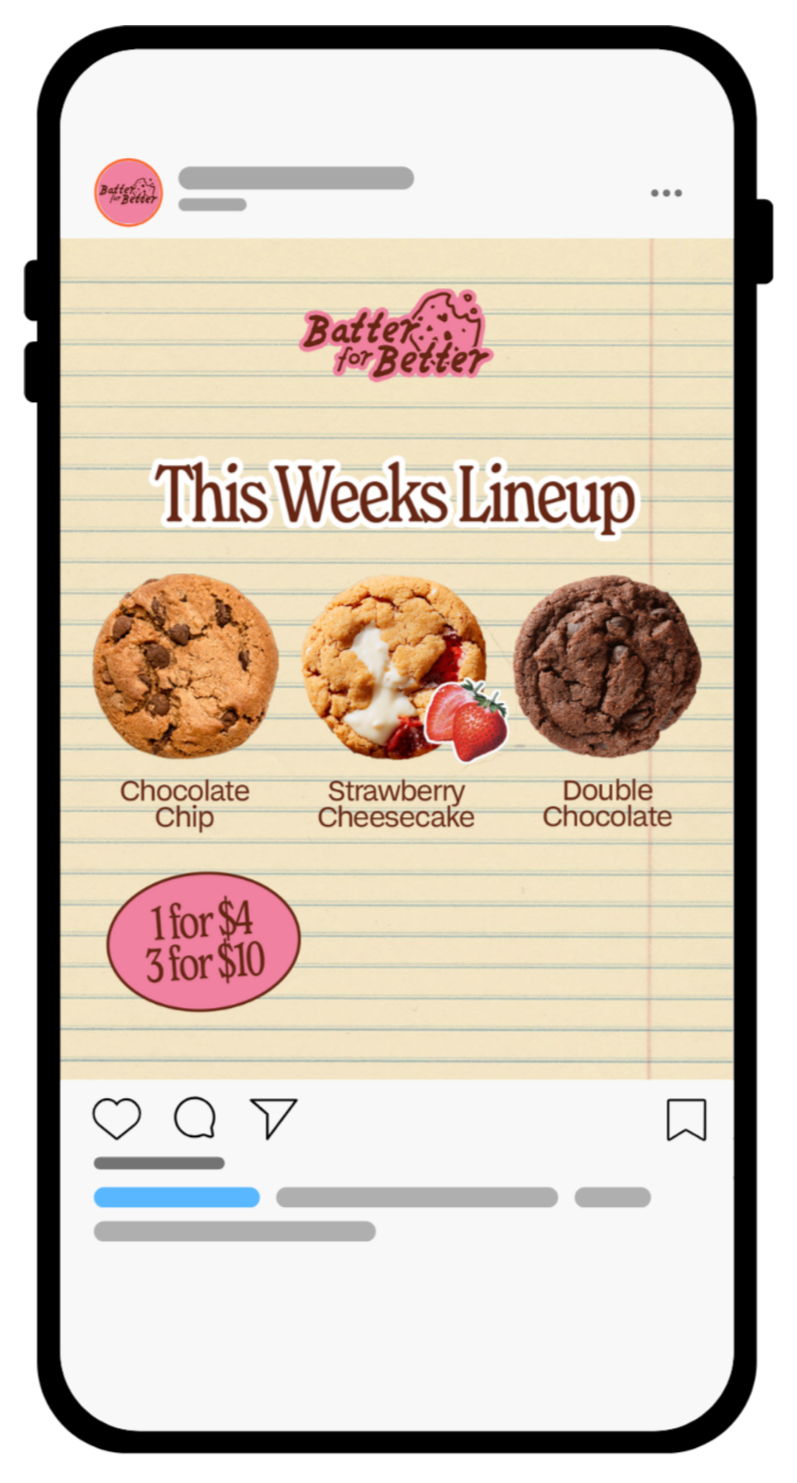
Batter For Better is a small, student-run cookie business that bakes homemade treats and delivers them to people. All their profits go to Loaves and Fishes, and they drop new flavors each week, similar to Crumbl Cookie.The goal of this project was to develop a new brand identity as well as a couple social media posts to guide future advertisements.
IDEATION
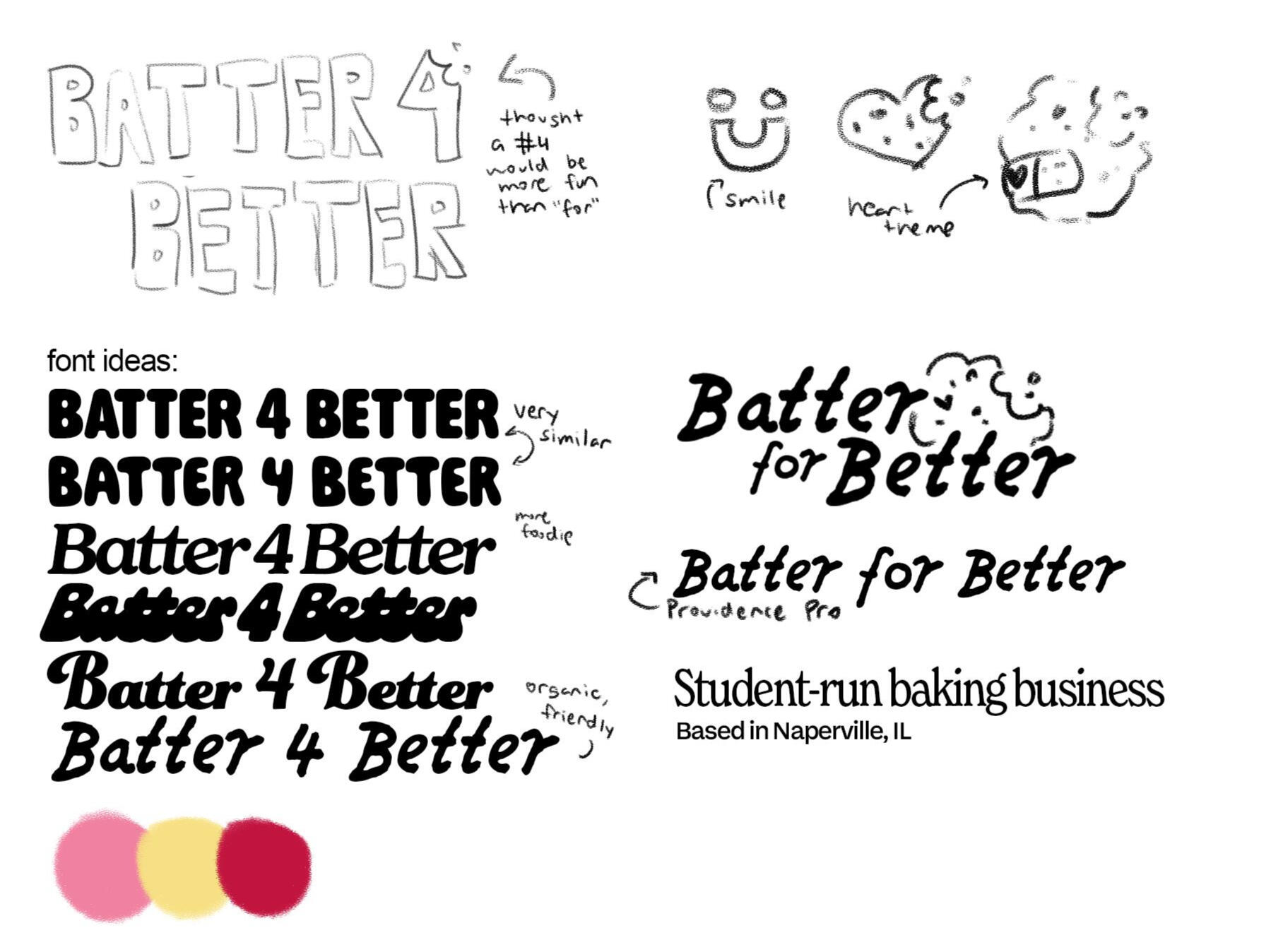
When I started this project, I basically had no constraints on what I could do. The previous logo and posts had a general pink color palette, so I kept that warm pink as the main color while testing out secondary hues like yellows and reds. Overall, I wanted to achieve something organic and friendly because of the brand's message. For the logo text, I landed on the font Providence Pro. It's a handwritten look that's still easy to read, and pairs well with the hand drawn cookie logo I created. The logo itself has a heart shaped chocolate chip, implying the brand's values of giving back.
PROCESS
This project was created on Adobe Photoshop. Its development spanned over a month, from May to June of 2026.My focus for this project was to create recognizable designs that matched the theme of the brand. I started with the logo: I tested out a variety of fonts, seen above in the ideation stage. Once my idea for the logo was complete, I moved on to creating a deliverable. While I was initially thinking of having the text stroke be a darker red, I ended up selecting brown to be the secondary color for most of my designs. For the cookie, I hand drew it using a pencil-like brush in Photoshop to ensure it matched my selected font.After the logo was complete, I worked on a Instagram post concept. Because most of the customers were other students, I went with a sheet of lined paper for the background. The post required information about the price, so I placed the text within an oval shape: I felt that it not only made the composition more interesting but also looking like a price sticker, implying someone had stuck it to the sheet.
DELIVERABLES
↓ DESIGN SYSTEM & LOGO MOCKUPS
↓ POST CONCEPTS
PROJECT OVERVIEW
Personal Brand & Website
BRAND IDENTITY & WEB DESIGN • 2026
OVERVIEW
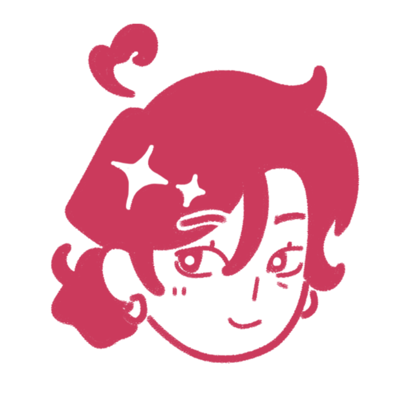
The objective of this project was to create a memorable and unique personal brand. This includes a website (what you're viewing now), logo, and design system. I also created a headshot icon to personalize my brand for viewers who may not know what I look like.
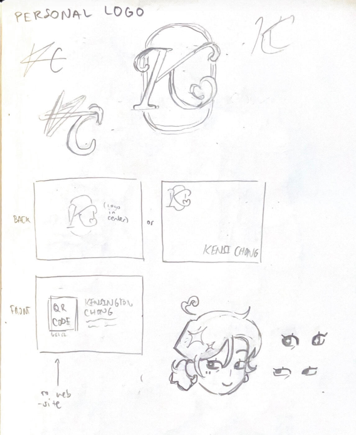
IDEATION
When I started this project, I basically had no constraints on what I could do. The previous logo and posts had a general pink color palette, so I kept that warm pink as the main color while testing out secondary hues like yellows and reds. Overall, I wanted to achieve something organic and friendly because of the brand's message. For the logo text, I landed on the font Providence Pro. It's a handwritten look that's still easy to read, and pairs well with the hand drawn cookie logo I created. The logo itself has a heart shaped chocolate chip, implying the brand's values of giving back.
PROCESS
This project was created on Adobe Photoshop. Its development spanned over a month, from May to June of 2026.My focus for this project was to create recognizable designs that matched the theme of the brand. I started with the logo: I tested out a variety of fonts, seen above in the ideation stage. Once my idea for the logo was complete, I moved on to creating a deliverable. While I was initially thinking of having the text stroke be a darker red, I ended up selecting brown to be the secondary color for most of my designs. For the cookie, I hand drew it using a pencil-like brush in Photoshop to ensure it matched my selected font.After the logo was complete, I worked on a Instagram post concept. Because most of the customers were other students, I went with a sheet of lined paper for the background. The post required information about the price, so I placed the text within an oval shape: I felt that it not only made the composition more interesting but also looking like a price sticker, implying someone had stuck it to the sheet.
DELIVERABLES
↓ DESIGN SYSTEM & LOGO MOCKUPS